Tuesday, 26 June 2012

THE THIRD LAYER CONTINUED.....


I know full well that some of you may be having difficulty with what to do next.  I have that problem sometimes too.  But let me assure you that you will get inspired again.  For example, this next page that I have completed.  I looked at it and wondered what it was that I was going to do with it.  Then I just jumped in.  The page needed to be painted that is for sure.  So I went ahead and painted it.  Then I thought, what does it look like?  Then it hit me.  The circles, the swirls, the paper in the bottom right hand corner looked like bushes and then I knew.  Yes, you’ve guest it, Van Gogh’s Starry Night.  Vincent Van Gogh’s work still inspires artists today.  I can only hope that my work will still inspire people after I’m gone.

I didn’t plan on being inspired by Van Gogh today but I was.  The more I do art, the more this happens to me.  The piece of art that I am working on takes me on an unknown journey.  Not that it talks to me.  I am not losing me mind, but when I am in the process of creating it, the way it looks at any given time, dictates the next step.  It’s very cool.

Let me encourage you to ‘just start’.  Add something, look at it, and add something else.  Keep trying new things, things that you like.  For example, if you like blues, then paint blues.  If you like flowers, paint some flowers.  If you like block letters, write some block letters.  If there are numbers that you like, then cut out some numbers.  You get the idea. 

Another way to get inspired is by looking at other artists’ work.  Under no circumstances am I telling you to copy someone else’s work.  Yuk!  Definitely no no.  But you can be inspired by other’s work just like I was inspired by Van Gogh’s Starry Night today.

Also, there are many prompts to get you going on the internet.  Not to mention the prompt that I give you.  You may just want to start writing about a prompt and before you know it images pop up in your head and you start drawing, cutting, gluing, etc.

Make sure that you have collected things that YOU like to help you create your pages.  When you go through your day, look around for items that you may want to use.  For example, you are in the lunchroom and you happen to notice a pretty colored wrapper around someone’s food.  Ask if you can have it.  You may take a flower from your garden and dry the petals and leaves out to use in your journal.  Flipping through magazines is a good way to find images/colors that you like.  Advertising and Marketing are big money makers.  That’s why there are great images around you.  You just need to be aware of them and use them.

Sometimes I just start doodling and then images appear.  Then I start developing them and before I know it, it starts to have a life of it’s own.  Just let your pen or pencil wonder.  You’ll start to see things too.

Don’t get discouraged.  Brilliant ideas are bound to come to you.  Somebody may say something to you, or you’ll be listening to a song, and it will be enough to inspire you.  Don’t forget to write down inspiring thoughts and images when you hear or see them.  Keep them handy for the future when you are looking for inspiration.

So back to my page today.   As I said earlier, I just started painting my page with colors that I like.  After gazing at it for a few minutes, I was set on using Van Gogh’s Starry Night as my inspiration.  I was wondering what I could use for swirls.  I just recently learned how to quill so I started slicing up paper about ¼ inch wide and 6 inches long.  Apparently WalMart has a shredding machine for $10.00.  I’ll need to run by and grab one.  Anyways, I then rolled the ends around a paint brush in opposite directions.  Pick paper that has some body to it.  I loosened the swirls a little and then started placing them around the circles and swirls of yarn.

When I thought about Van Gogh’s Starry Night, I thought about his bush and the movement he created in it by swirling his brush strokes.  I took some more cut paper and placed it on top of the textured looking bush in a curving fashion.


The peaks at the top of the page relate to the mountains in his work, and the rectangles on top of the peaks relate to the buildings.


I cut out a couple of moons from yellow colored paper and placed them on pieces of accordion folded paper for the unexpected.


The cones I created came to me when I remembered that Van Gogh was hugely inspired by the Japanese artists.  The cones remind me of the conical hats that the Japanese wore.  You make these hats simply buy cutting a circle, slice it halfway across the diameter of the circle, add a dab of glue on one side of the slit, and pull the other side of the slit over the glue until you form a cone.


Lastly, I wanted to show you something I saw while working on my page.  I was almost done with my page except that it felt unbalanced to me.  The bottom right hand corner of the page was too dark and heavy.  It needed some lightening up.  So I drew a few Japanese inspired flowers with a Sharpie, and then used watercolor to paint them.  Sharpie does not bleed when wet making them ideal to use with watercolor.  Placing them on the bottom right hand corner did the trick.  It felt balanced to me then.


My journal pages have lots of dimension to them and my books are bulging, but I love it.  As long as you don’t sit on your book, your images shouldn’t flatten.  Handle with care!


PROMPT FOR THE WEEK


Tough Times?

If you are human, and if you are lucky enough, you will experience rough times in your life.  Yes, it was not a typo, you are lucky to experience rough times in your life.  Why?  Because it is through the tough times that we learn and grow.  Times of successes and triumphs become catalysts to positive transformation in life, but so do times of difficulty.

It’s difficult to go through life without experiencing some kind of hardship.  It could be a loss of a job, loss of a marriage, loss of a friend, or maybe a loss of a loved one.  Whatever the loss is, it is an extremely significant experience.  I believe, and for myself, these are the times when people grow the most.  Of course it is not pleasant when these hardships come, and there is always a time of grieving, disappointment, and heartache, but the potential positive transformation that is possible from these experiences far exceed that of the transformation achieved from our times of successes and triumphs.  It is almost as if someone has thrown a big bucket of iced cold water at you and suddenly, almost violently, you wake up from a time of slumber and become very aware of the fact that you have been asleep, and that your life no longer makes sense.  It is at this point that you are forced to re-evaluate your life and hopefully make it better.  It’s like you have been given a second chance, and that you can start brand spanking new.

Looking back, I realize that the greatest challenges that I have experienced have defined me as to who I am today.  Without them, I would still be skimming life, letting life control who I am instead of taking control and directing my own life.

Friend, don’t be afraid of difficult and trying times in your life.  I encourage you to use these times for growth.  Times to re-evaluate and renew.

Believe it or not, we really do care about you.

We will resume the journal project on July 9th, enjoy your Fourth of July Celebrations!


Dear brothers and sisters, when troubles come your way, consider it an opportunity for great joy.  For you know that when your faith is tested, your endurance has a chance to grow.  James 1:2-3


Thursday, 21 June 2012

Another Great Review, Music Art!

This is a guest post by our wonderful friend Rachel who blogs and did a great review about our art dwellers projects by mail! You can learn more about how to receive these projects by reading our previous blog entry.

Art Dwellers is an art business down in Friendswood, TX that asked my kids and I to try out a couple of their art projects!  Crafts?  In the mail?  With art supplies and instructions???  Yes, please!!!
Jayden got a box full of stuff to create some musical instruments.
First up, a tambourine.
Jayden started by using water colors to paint on some paper circles.
We then put dried black beans on a styrofoam plate, covered it with a second plate, and then tied strings through the pre-punched holes.
Jayden squirted glue all over the top of the plate and he put one of his painted circles on top of it, and then did the same thing on the other side.
Once the glue was dried, viola!  Tambourine!

Next up was a rain maker.
Jayden used a paper towel tube and glued colored paper all over the outside of it.
Then I rubberbanded a cupcake liner to one end and Jayden filled the tube with dried rice.
And I rubber banded another cupcake liner to the other end and we had our rain maker!
Our kit also came with a music man mustache!
These are by far the best kid instruments in the house, they make noise, but are not super loud, so the kids can play them as much as they want without me wanting to throw them out the window!

Art Dwellers Project Review

This is a guest post by our wonderful friend Rachel who blogs and did a great review about our art dwellers projects by mail! You can learn more about how to receive these projects by reading our previous blog entry.

Art Dwellers sent Willow an art package in the mail too.  She got a box full of stuff to make a flag banner with her name on it!

She started by picking a colored flag and a letter of her name.  The letters for her name aren't just plain white letters, they are glittery letters.  And if you know Willow, you know that Willow and sparkles go together!
Once all the letters were glued onto the flags, we glued the flags onto a long, skinny strip of fabric.
And then I tied smaller pieces of fabric strips in between each letter. How cute is this????
How cute is she???? :)

Sunday, 17 June 2012

THE THIRD LAYER


THE THIRD LAYER

 Many, many years ago, right after high school, I worked as a secretary/office manager.  One of my tasks was to type up documents for my bosses.  This entailed having to read their writing.  I’ve got to tell you, this was no easy feat.  The handwriting, in many cases, was terrible.  So much so, that I would need to continually ask the originator of the document to read it to me.  How crazy is that, and what is the point of writing if no one can read it?  Writing beautifully is easy.  Sit up straight, put your forearm on the table on a 45 degree angle, and instead of moving your fingers while you write, move your whole hand and forearm while pressing lightly on your pencil.  I have taught many terrible scrawlers how to write and it has changed their world.  Give it a try.  You’ll see.

The prompt for this week’s journal page is below.  After you have read it, start writing.  Write anything that comes to mind.  Keep writing until you can’t think of anything to write about.  Draw pictures if you feel like it.  Write large/write small.  Decorate your letters.  Vary the style of writing.  Print or write cursive.  It doesn’t matter as long as you are writing.  Don’t worry that someone else is going to read what you have written.  This is YOUR journal.  YOUR own thoughts.  Be honest and be real.  There is no reason why you couldn’t go back later and continue to write.  You’ll find out how freeing journaling is if you haven’t already.

Once you have exhausted your ideas in terms of the prompt, try picking out important words and highlight them by tracing (bad word in art) over them with the same writing tool you have been using, or use a different color, or thicker/bolder tool, or highlighter, or rewrite, and overlap them using a stencil, cut out magazine/newspaper/book letters, stencils, yarn/string, letter stickers, or a label maker.  When you emphasize words of importance it will help you to remember them and it makes it easy to remind yourself of what you wrote when you look back on your pages.  You may even want to type your thoughts on your computer.  If you go this route, many fonts, colors, and sizes of letters are at your disposal.  Check out 1001 Free Fonts on the web.  I like the idea, however, that you use YOUR handwriting.  This is your journal, about you, and your handwriting is just another part of you that makes you unique.

You may also want to de-emphasise some words.  Write them small, put a glaze over them, put a piece of tissue paper over them, scratch them out, put a piece of paper on top (possibly with another word that you prefer).  The greater variety you use when writing your thoughts, the more interesting your page will be. 

The writing in your journal can be done any time you are working on your page.

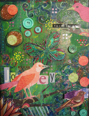
I decided to use my modeling pasted page from last week for this weeks demonstration.  I started by adding paint over the whole page.  Choose colors that you like.  You can drag paint as seen in the last blog, or use your brush and blend your colors as you go.  Once a base coat has been added, go lightly over the top of the raised portions of your page with a contrasting color.  If your base color is dark, you might want to use a light color on the raised portions, or if your base color is light, you may want to use a dark color on the raised portions.  I suggest that you use a piece of paper towel or a flat brush to gently catch the ‘hills’ on the page.  Not a lot of paint is required on your paper towel or brush.  If using a brush, turn it to a 90 degree angle to your page, and with little paint, gently graze the hills.  I used several colors of paint on my hills until I was happy with the look.  Make sure that paint is dry between each layer or you will end up with mud.


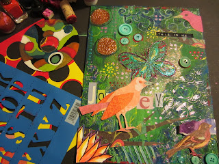
 I then used nail polish, stamps (including a wine cork, lids, and legos), buttons, stencils, paint, and glitter to add more color, texture, and interest to my page.  I love color and brightness, and I find that nail polish, glitter, metallic paint, and gloss helps me to achieve this.  As an aside, nail polish is great to use on metal objects as well.  It sticks!


What about images?  Do you have some artwork that has been sitting around for a while that you can use?  Of course you can find all sorts of interesting images in books, magazines (bird in lower right corner of my page), newspapers, and the Internet, but let me also encourage you to draw.  I have used many methods in teaching students how to draw over the years but this is the easiest and most successful method by far.

Find yourself an image.  It is always best to have the image you are wanting to draw in front of you.  Unless, of course, you have a photographic memory which allows you to recall detail.  I have chosen a bird, but you get to choose what you want on your page.  It doesn’t matter what you draw, these steps will bring you success.

Start by looking at your image.  What geometric shapes do you see?  In the bird, I see an oval for his head.  So I draw an oval (1).  Then I look at his body and I see another oval.  So I measure the head on my image.  With that measurement, I determine how many heads make up the body of the bird.  For my image, it was approximately three heads make the body.

THIS IS REALLY IMPORTANT.  I then measure the head (oval) that I just drew and use that measurement to count three heads for the body.  If you use the measurement of the IMAGE on your drawing it will be wrong.  You need to use the measurement of the head you drew in order to measure the body (oval) that you will draw (2).

The head, in drawing terms, is your basic unit.  You will use this basic unit to measure every part of your image.  You will ask yourself, “how many heads make the tail”, “how many heads make the wing”, “how many heads make the beak”, and so on.  Everything you draw will be drawn in relation to your basic unit (head). 

How many of your head makes your body?  7 heads?  8 heads?

His tail (4) (…don’t asked me what happened to number 3) is shaped like a triangle, as are his wings (5 and 6).  Oh, and yes, so is his beak (7).  Then his legs and feet are a combination of triangles and rectangles (8).


 Once you have all of the geometric shapes placed, then it’s time to LOOK at the actual image and see the outline of it (the contour of it).  Adjust and tweak your geometric shapes (lines) until they resemble the actual image.


 You can, at this point, if you wish, add as much or as little detail as you want.  Erase all of the lines you don’t need.

Cut out and glue your drawing to your page.  I prefer to use a product called ‘Art Glitter’ (no glitter in it) to adhere items to my page.  What I like about it is it holds quickly unlike white glue.

I actually wanted to cut my bird out of decorative paper.  I then am able to put my drawing aside for future pages.  I like paper, and there are so many choices available to you.  I turned my drawing over and scribbled behind my drawing with charcoal.  You can also use pencil or pastels for this part.  This becomes your carbon allowing you to flip your drawing right side up and trace (bad word in art) your drawing onto a decorative piece of paper.

 You can get as detailed as you want.  I could have cut feathers out and made it more dimensional but I liked the look of the way it is right now, and decided not to go any further.


AS AN ARTIST YOU CAN DECIDE WHEN TO STOP.  IF YOU BELIEVE THAT ONE MORE THING ADDED TO YOUR ART WOULD WRECK IT…IT’S A GOOD TIME TO STOP!

I like my finished page.  It rocks!

PROMPT

Here is your prompt for this week.  Remember, if it doesn’t apply to you, you can speak about it in general terms, or in terms of someone else that you know.

TIME TO CHANGE THE CHANNEL?

Do you find that you tell yourself that you are not enough, that you don’t measure up, and that you are incapable?  Listen to yourself throughout the day.  What lies are you telling yourself over and over again?  It’s time to change the channel.

When I was growing up there were so many people telling me that I wasn’t good enough.  I was too tall, I wasn’t pretty, I was hated, I was stupid, I was weird and different, I was limited in what I could accomplish, I was destined for a humdrum, center of the road, existence.  The sad part is, is that I believed what everyone was telling me.  I believed that everyone was better than I and that I would not amount to anything.  I allowed those lies in and allowed them to shape and form me.

Truth be known, you or I wouldn’t dare treat anyone we cared about the way we treat ourselves in our own heads.  Would you say these things to your child, your spouse, or your friends?  Give yourself a break and change the channel.

I have found that this is not an easy task, and I still struggle with it daily.  But I do know the truth now, and when I catch myself, I quickly face the lies head on and toss them out and replace them with truths.

The truth is that you are good enough.  This doesn’t mean that you shouldn’t be growing and bettering yourself constantly, (life isn’t over yet), but where you are at any given moment in the day is absolutely fine.  You are good enough friend…you are good enough.

I encourage you to remove your negative talk and shower yourself with praises and affirmations every day.  You are meant to be, you have every right to be here, and you are making a positive difference in this world. 

Believe it or not, we really do care about you.

 But Jesus turned her about, and when he saw her, he said, Daughter, be of good comfort; thy faith hath made thee whole.  And the woman was made whole from that hour.  Matthew 9:22

Sunday, 10 June 2012

The Next Journal Layer: Creative Processes

The Next Journal Layer: Creative Processes


I love the feel of the pages when they are all glued and taped.  They are heavy and rich to the touch even before they are layered with paint, paper, fabric, etc.  By the way, toothpaste does not work to create texture as it does not dry.  Ewe!!!  What follows are suggestions or ideas to get your creative juices flowing this week. 

Texturing is a lot of fun and it really makes a difference in your art.  Texture can give excitement to your piece and make it less flat to the eye.  Here are a few suggestions to get you started.


Stencils


You can use a ready made stencil.  There is a wide selection of stencils available at Michael’s and Hobby Lobby for really inexpensive.  I have chosen to use a part of my chandelier stencil.  Lay it up against your page, then spread the modeling paste (or joint compound available at your local hardware store) over the top making sure to smooth it.   Use a Popsicle stick, putty knife, or anything else that is flat and can spread.  However, if you would like to add texture to the stenciled paste, do so now while the stencil is still in place and the paste is still wet.  Try sticking different textures into the paste or simply apply a sheet of paper towel over it, press lightly, and lift.


Now lift the stencil straight up to take it off your page.


You can also use chicken wire, a potato masher, lace, and doilies.  This list goes on and on.  Here is an example using wire mesh.


If you would prefer to make your own stencil, you can draw an image onto a thin piece of cardboard, or a clear plastic sheet protector, etc. and cut it out with a box cutter.  Shown here is a plastic sheet protector that has been put over a photocopy of a butterfly.  I simply cut out the shape and was able to use the plastic as my stencil.   Be careful!  Those things are sharp.  Always cut away from you.


You can also create texture by pressing things into the paste.  Here I pushed paper towel into the wet paste and pulled up.


Another great idea is after you put some paste on the page, draw an image, words, or design into it with the end of a brush or pencil.


You can pretty much push anything into the paste to get texture.  Here is what happens with corrugated cardboard.

This page is now ready for the next step.

Texture

Adding texture to your pages is not difficult.  You can attach textured items to your pages with either gel or Mod Podge.  Here is corrugated cardboard, and textured paper.  You can buy corrugated cardboard or take a piece of a cardboard box and tear off the top layer.


I brushed on some gel and added some yarn, cut circles out of decorative paper, and then added buttons.  What items do you have to add to your page to create texture from your home or from outside?  Cheese cloth, corduroy, nails, wire, mesh, dried flowers and leaves, feathers.  Just look around.  You’ll find lots to work with.  More than likely these items will not remain the same color in the next step.

Paper


Using paper as your second layer is easy and effective.  Simply tear up some decorative paper, colorful magazine pages, gift bags, paper bags, and/or tissue paper and adhere to your page using gel or Mod Podge.  I have also added watercolors to two ply paper towels, then separated them into single ply.  Remember to distribute colors and textures throughout your page so that it is balanced.  With the sample below the red is powerful.  I placed the red in a letter ‘C’ to keep the viewers eye in my piece.   Try a letter ‘S’ as well!  If you have time, it would be helpful for you to read about elements and principles of design.  Keeping these in mind while working, will help you to create more exciting and interesting pages.


The collage works the way it is, but I wanted to add some dimension as well, so I began to overlap some more papers on top of what I had already.  You will notice that there is still a letter ‘C’ going on by the use of ‘arrows’ leading the viewer’s eye throughout the collage and making the center the focal point.  It is like the focal point has been framed.  I was able to achieve dimension by overlapping and by not gluing the pieces of paper completely down.  This also allows for shadows.  Yum!  I’m thinking that the light rectangles will be used as a backdrop for words in my journal.

 This was done with tissue paper that a store put in my purchase bag, and water colored paper towels.


Also know that when things in our art are laid down or drawn on a diagonal, you create movement in your piece.  This also helps to make your art more exciting.

Paint

Choose some colors that you like and do some drag art.  REALLY IMPORTANT…YOU NEED TO WAIT IN BETWEEN LAYERS ON PAINT UNTIL THE PAINT IS DRY, OTHERWISE YOU COULD END UP WITH MUD.  Remember light colors come forward and dark colors recede. To begin, drip some acrylic paint on your page keeping in mind balancing of your colors.  With a piece of cardboard, or Popsicle stick, etc., starting at the top, pull the paint down the page.  Easy Peasy.  Make sure that you have newspaper underneath as you will be pulling excess paint off of your page.


You can use your page like this or you can keep going.  Once the paint was dry, I did some more drag art over top of the existing drag art.  You can use a blow dryer to speed up the drying between layers of paint.  First, I added two additional colors over top of the first colors.  Then I used a baby wipe to make the circles again while the paint was still wet.  I waited until the paint dried again, then I added two more colors.  While the third layer was still wet, I took a baby wipe and made the original circles again.  You can draw whatever you like.  You may like circles, squares, squiggles, Fleur De Lis’, birds, stripes, whatever.  This is your art, so do what you like!


You can see the variety of colors underneath.  It is pretty like this and I could have stopped here, but I was wondering what would happen if I added some black and white for effect. 


I liked this, but then I thought what about adding ink.  Adding ink and dipping it with alcohol would create even more texture.  It turned out beautifully.


I then saw some pretty acrylic colors and decided to see what dripping would look like on top of my page.   This is done by applying some paint to your page, tilting the page, and spraying the paint with water.  You can manipulate the direction of the paint by tilting and adjusting your page.  Looking good….but then I thought I really liked the original look with the circles, so…


I dragged more paint and, with the baby wipes, made more circles.


I could have stopped at any point.  But I wanted to take some risks and I am truly happy with this final look.  It looks rich with color, texture, and is ‘artsy’.  Very cool.  Have fun with acrylic.  The wonderful thing about acrylic paint is, at any point, I could paint a layer of white acrylic paint or gesso over it and start over again.  Layers of paint, in my opinion, is more interesting to look at then one single layer.  It’s a personal thing of course.


What a difference from when I began this page.  Anyone looking at these pages would probably not believe that they are, indeed, the same page.

Embossing

Another simple but effective way to add texture to your pages is to draw an image or pattern, trace (bad word in art) over the picture with Elmer’s Glue or Aleene’s tacky glue, cover it with tinfoil, then finally paint over the top.


Start anywhere on your image, and press lightly on your bottle of glue.  When you trace your image with glue, make sure that your glue doesn’t gush out of our bottle, you keep a steady flow, and that your glue bead raises from your page about an 1/8th  to ¼ of an inch.  Watch the glue coming out of your bottle and move it constantly.  Once you have the glue down on your image, use an object like a toothpick to help you to spread and straighten your glue, and to get rid of any air bubbles.

Wrap the tinfoil completely around your page and tacking it on the back side with tape.  With your finger or a q-tip, softly rub along the lines of glue that you made.  This will ensure that you achieve an embossing (raised) effect.


Finally, with a soft cloth, lightly rub shoe polish or oil pastels over the image allowing the color to fall on the flat areas of your page.  The shoe polish dries and polishes up nicely.  It also doesn’t come off when you touch it.  The oil pastels do come off slightly just to let you know.  Great news is that the polish comes in a lot of different colors.  Now I’m thinking a huge canvas, big  detailed image, and lots of shoe polish colors.  Hmmmm?  The more details your image has, the more interesting it looks.  This is a simple example.  Can you imagine a image which has lots more detail.  It is so much potential.


Alcohol Inks


Using alcohol inks is a lot of fun and is a quick technique to get your pages started.  Paint some ink in sections on your pages, and drip some  ‘rubbing alcohol’ over the top WHILE THE INK IS STILL WET.  It’s fun to watch the spots show up.  You can achieve the same thing with watercolor as well (although the inks are more intense in color).  The beauty of this technique is that you just don’t know what you are going to get in the end.  The more the ink, the bigger the splotches.


Paint some ink in sections.


Drip some rubbing alcohol from a q-tip.


Continue to add sections of color and dripping rubbing alcohol on top.


Isn’t this cool?


Fabric


I have always loved fabric, and I have sewn everything from clothing, to draperies, to accessories.  Love it.  So it’s no surprise to see me adding fabric to my suggested first layers.  This is a great way to get rid of scraps of fabric and old clothing.  There are tons of ideas for fabric, from landscapes, to figures, to flowers.  Every color you would need to create an image is available to you from stores like Jo Ann fabrics and Hobby Lobby.  You can also mix fabric, paints, and papers together.  Oh the fun you can have.

Here I have layered a piece of felt, a layer of fusable webbing (available at the same stores as fabric) the same size as the felt, and then tore fabric and layered them on top of the fusable webbing.    Your felt and your webbing should be the same size as your page.  Once you have the fabrics laid down and you’re happy with the look, iron the fabric.  The fusable web will adhere all three layers together.  You can, if you wish, do some embroidery stitching on top of this.  For instructions on how to embroider, just search the web.  There are several places which give you step by step instructions.


You can add acrylic, ink, or watercolor paint on top of the fabric if you wish to add more interest.  In my samples, I embroidered a little, painted a little, and used my sewing machine a little, but of course you could just do a simple running stitch if you don’t have a sewing machine.  Once you have your fabric the way you like it, you can either glue, staple, pin, or sew it into your journal, making it ready for the next step.


There are so many other possibilities including mixing any of these techniques together.  The important thing is to let go, have fun, and let the pages tell you what to do next.  I will be adding new ideas to this blog as time goes on so make sure that you check on me every once and awhile.

Next Monday, I will start adding a third layer to these pages and I will begin to include some prompts for you to start writing.  I am having so much fun and I hope that you are too.

I am so glad that we can share this time together.  Please send me some pics of your pages at artdwellers@gmail.com so that I can put them up on my blog.  Believe it or not, we really do care about you.